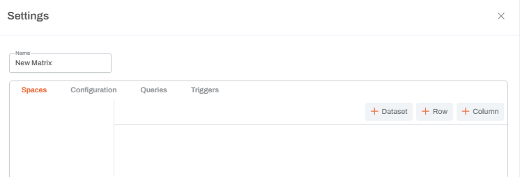
Matrix Widget
The Matrix widget is organized into Spaces, which allow you to structure, query, and format data flexibly. Use the buttons in the top-right corner to add three types of spaces: Dataset, Row, or Column.
Spaces
Dataset

Adding a Dataset space brings model data into the matrix. Click Edit Query to open the model query editor and configure what data appears.
Dataset Configuration Options
- Change the Space Type: Convert the dataset space into a Row or Column space to behave as a structural header.
- Change the Query: Update or replace the query to adjust which data is pulled into the matrix.
- Select Row or Column Ranges: Specify exactly which range of rows or columns from the dataset should appear.
- Show Raw: Reveals the underlying JSON definition for debugging or copying settings.
- Inline Checkbox: Displays the dataset side-by-side with the first dataset. This is ideal when multiple datasets share the same row metadata.

Formatting Controls
Each dataset space includes several formatting sections (Space, Row/Column Headers, Data, etc.). In every section, you can:
- Preview formatting in the sample text box.
- Set colors (palette, picker, or hex) and adjust alignment/font weight.
- Choose a Style Type: Decimal, Currency, Percent, or Unit.
- Use Grouping (Commas):
| Mode | Behavior | Example (1052002) |
|---|---|---|
| Always | Always add commas | 1,052,002 |
| Never | Never add commas | 1052002 |
| Auto | Add commas when helpful (≥ 1,000) | 1,052,002 |
| Min2 | Add commas only for large numbers (≥ 1,000,000) | 1,052,002 |
Rules
You can define two types of rules in each section:
- Formatting Rules: Apply specific styles when a condition is met.
- Validation Rules: Apply attributes like flags or warnings when a condition is met.
Section-Specific Settings
Space-Level Formatting
This controls the entire dataset and acts as the highest layer. Formatting applied in lower sections (Headers or Data) will override space-level styles.
Row and Column Headers
- Hide Axis: Found in both header types. Use this when datasets are Inline to hide duplicate labels.
- Custom Cells: You can insert additional cells to display Caption, Name, Key, or Custom text. The dimension index corresponds to the order of dimensions configured in the model query (Columns section). In the following example, the key is shown for index 1, being the second dimension in the model query.


Row Header Indent Types
Row headers include unique indentation settings:
- Absolute: Indents based on the member’s level relative to the top of the hierarchy.
- Relative: Indents based on the level relative to the nearest parent in the hierarchy.
- None: Displays no indentation.

Corner Headers
Controls the top-left cell where row and column headers meet. It supports the same options as column headers, except for the "Hide Axis" checkbox.
Data Formatting
This applies to the actual numeric or text values.
- Locked Checkbox: If the query reaches leaf levels, users can typically edit data. Checking Locked prevents users from saving or editing these values.
- Hyperlinks:
- Internal: Navigate to dashboards, workflows, or other Una assets.
- External: Open a website or outside resource.
Supported Functions
The Matrix supports Excel-like formulas to manipulate data within the widget.
- FINDCELL: Returns a value from the same dataset.
- Syntax:
FINDCELL("row.0", member_key, ...)
- Syntax:
- FINDCELLIN: Returns a value from a specified dataset.
- Syntax:
FINDCELLIN(dataset_name, "DimensionName", member_key, ...)
- Syntax:
Rows
When adding a new row space, the space name is auto-generated as row_{auto generated string}. Users can format the entire space, including:
- Background and Text color
- Alignment and Font weight
- Editor Type and Number of Decimal points
- Style and Grouping options
- Formatting or Validation rules

Template Section
Users can add cells by clicking the “+ Add Cell” button and clicking the settings icon to open a modal with the following options:
- Name: Set a internal name for the cell.
- Label: Define the text displayed in the cell.
- Formula: Type any formula directly into the cell.
- Extends: Applies the formula across the entire row.
- Locked Checkbox: Prevents editing of the cell.
- Styling: Standard options for background, text, and alignment.

Columns
When adding a new column space, the space name is auto-generated as column_{auto generated string}. Users can format the entire space, including:
- Background and Text color
- Alignment and Font weight
- Editor Type and Number of Decimal points
- Style and Grouping options
- Formatting or Validation rules

Template Section
Users can add cells by clicking the “+ Add Cell” button and clicking the settings icon to open a modal with the following options:
- Name: Set a internal name for the cell.
- Label: Define the text displayed in the cell.
- Formula: Type any formula directly into the cell.
- Extends: Applies the formula across the entire column.
- Locked Checkbox: Prevents editing of the cell.
- Styling: Standard options for background, text, and alignment.
Note: Currently, Row and Column spaces do not have access to metadata. Functions like
FINDCELLandFINDCELLINwill not work in these spaces (this feature is on the roadmap).